Analytics
Break down cost, requests, and tokens by model for any project
The Analytics page shows where a project's spend actually goes. It leads with the project's totals for the range, then breaks usage down — as a ranking and over time — so you can see what drives cost, requests, and tokens across any date range.
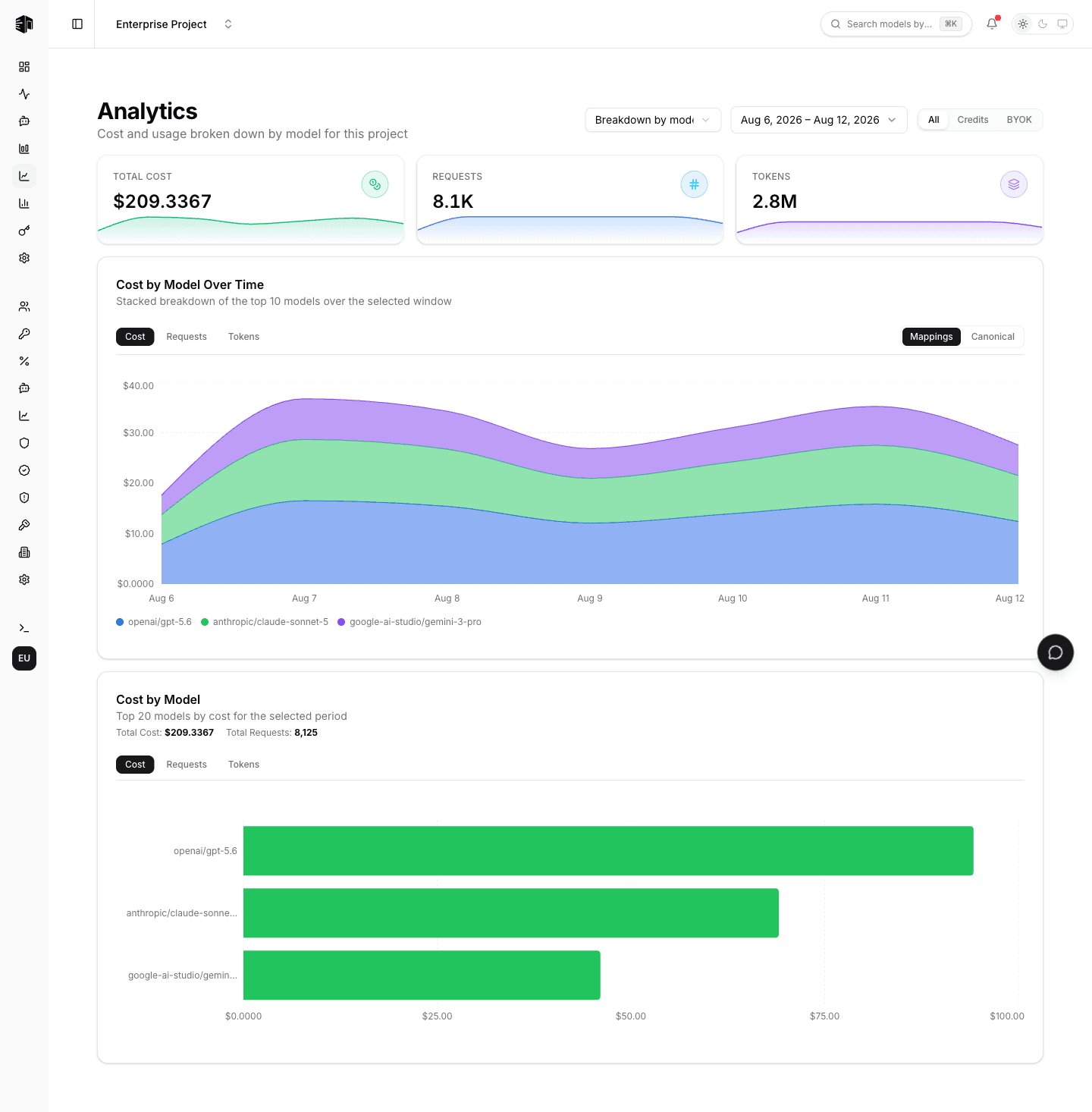
Open it from the Analytics item in the project sidebar. Like the rest of the dashboard, the page respects the shared date-range picker at the top, so every chart reflects the same window.
Totals
Three cards at the top show the project's total cost, requests, and tokens for the selected range, each with a sparkline of its daily values. They are computed from the same data as the charts below, so the total and the breakdown always agree.
Choosing a breakdown
The Group by selector switches which dimension the two charts break the project down by:
| Breakdown | What it shows |
|---|---|
| Model | Spend per model (the default) |
| API key | Spend per API key in the project |
| User | Spend per team member — Enterprise, owners and admins only |
Breakdown by user answers "what is each person on this team costing us?" in the same view as the project total. It is available to organization owners and admins on the Enterprise plan — see Member Analytics.
Spend is attributed to whoever created the API key that made each request. Traffic from platform keys has no member behind it, so it is shown as Unattributed rather than dropped, keeping the per-member rows summing to the project total.
Cost by Model
A horizontal bar chart that ranks the models used in the selected range. Switch the metric with the tabs above the chart:
| Tab | What it ranks |
|---|---|
| Cost | Total spend per model, in USD |
| Requests | Number of requests routed to the model |
| Tokens | Total tokens (input + output) |
Use it to spot the one or two models responsible for most of your bill, or to confirm that traffic is spread the way you expect.
Cost by Model Over Time
A stacked area chart that plots the same three metrics across the date range, with one band per model. It has the same Cost / Requests / Tokens tabs, plus a Mappings / Canonical toggle:
- Mappings — each model variant is shown separately, exactly as it was requested (for example a custom provider mapping is kept distinct from the built-in model).
- Canonical — variants of the same underlying model are collapsed into one canonical model (the provider prefix and tag are dropped), so
openai/gpt-5.5and a custom mapping of it count as a single line.
Switch to Canonical when you care about the underlying model's total footprint; stay on Mappings when you need to compare specific routes.
The Mappings / Canonical toggle is specific to models — the API key and user breakdowns rank named entities, so there is nothing to collapse.
How the data is computed
Both charts derive from the same activity data the rest of the dashboard already reads — there is no separate analytics pipeline to wait on. Aggregation happens per time bucket and is timezone-correct, so totals line up with the Activity and Usage pages for the same range.
For a per-key view of the same breakdowns, see API Keys. For an org-wide, per-person view on the Enterprise plan, see Member Analytics.
How is this guide?